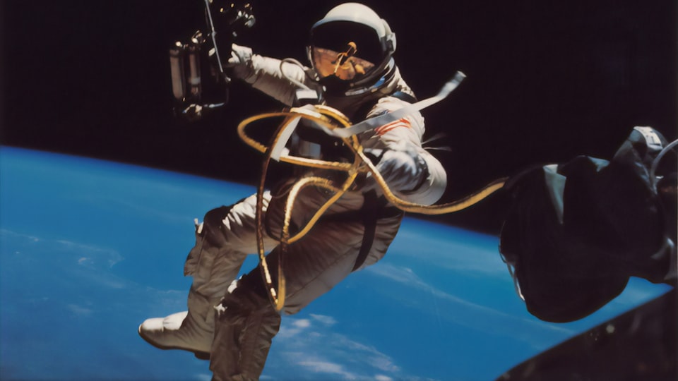
A one-size-fits-all web-component to display a 3D model in augmented reality using the native capabilities of the mobile device - Quick Look on iOS and Scene Viewer on Android. Heavily inspired by model-viewer.
Install the npm package...
npm install @leoncvlt/ar-button...and import the library in your project (and the default button styles if you wish)
import "@leoncvlt/ar-button"
import "@leoncvlt/ar-button/styles.css"
Or import from a CDN, if that's your cup of tea
<script type="module" src="https://unpkg.com/@leoncvlt/ar-button"></script>
<link rel="stylesheet" href="https://unpkg.com/@leoncvlt/ar-button/styles.css">
Use it like a normal html component
<ar-button
    src="https://github.com/leoncvlt/ar-button/raw/master/assets/Astronaut.glb"
    ios-src="https://github.com/leoncvlt/ar-button/raw/master/assets/Astronaut.usdz"
    link="https://www.nasa.gov/"
    title="A 3D model of an astronaut">
      See in Augmented Reality
</ar-button>
Alternatively, you can also activate AR programmatically without using the
ar-button:
import { activateAR } from "@leoncvlt/ar-button";

// trigger on an user interaction, like a click
activateAR({
  src: "https://github.com/leoncvlt/ar-button/raw/master/assets/Astronaut.glb"
  iosSrc: "https://github.com/leoncvlt/ar-button/raw/master/assets/Astronaut.usdz"
  link: "https://www.nasa.gov/"
  title: "A 3D model of an astronaut
})Navigate to this page on a supported mobile device and click the "See in Augmented Reality" button on the bottom right of the image to see a friendly, blocky astronaut in your space

Note that some attributes only have effect when using Scene Viewer on android,
while others only when using Quick Look on ios
src android |
The URL to the 3D model. This parameter is required for ar-button to work on android devices. Only glTF/GLB models are supported. |
link android |
A URL for an external webpage. If present, a button will be displayed in the scene viewer UI that intents to this URL when clicked. |
title android |
If present, display this text as a title in the scene viewer UI. The name will be truncated with ellipses after 60 characters. |
ios-src ios |
The URL to the 3D model. This parameter is required for ar-button to work on iOS devices. Only USDZ models are supported. |
applepay-button-type ios |
If present, displays a "Pay" button with the Apple Pay branding in the quick look default
UI. Has to be one of the available button options (e.g. plain,
check-out, etc). For more information, see
Apple's documentation.
|
checkout-title ios |
If present, display this text as a title in the quick look default UI. Only works if
supplied alongside
checkout-subtitle, price, and either
applepay-button-type or call-to-action.
|
checkout-subtitle ios |
If present, display this text as a subtitle in the quick look default UI. Only works
supplied alongside
checkout-title, price, and either
applepay-button-type or call-to-action.
|
price ios |
If present, display this text nexy to the subtitle (automatically inserts a comma) in the
quick look default UI. Doesn't actually need to be a monetary value, but don't tell
anyone. Only works when supplied alongside
checkout-title, checkout-subtitle, and either
applepay-button-type or call-to-action.
|
call-to-action ios |
If present, display this text as a button the quick look default UI. Only works when
supplied alongside
checkout-title, checkout-subtitle, price and
applepay-button-type is not defined.
|
custom-banner ios |
An absolute URL to an html file. If present, the quick look UI will be rendered from this html file instead. Has to be served over https. For more information, see Apple's documentation. |
custom-height ios |
If custom-banner is present, sets its height. Set this to small,
medium, or large to set the banner height to 81, 121, or 161
points, respectively.
|
| show-if-unsupported | If present, the button will still be displayed on platforms where AR is not supported (e.g. web) - if not, it will be hidden. |
| no-scale | If present, users will not be able to scale the model in AR - it will still be possible to move and rotate it. |
| fallback-url |
This is the URL that clicking the button navigates to when on platforms where AR is not
supported and show-if-unsupported is enabled; or if on an
android device without Google Play Services for AR installed.
|
| ar |
This attribute is set automatically once the ar-button is initialized to either
scene-viewer, quick-look or unsupported. Can be
useful for styling purposes.
|
| initialized |
Fired when the button has been initialized and the right AR backend for the device has
been detected. The detail parameter of the event will return either
scene-viewer, quick-look or unsupported
|
quick-look-button-tapped ios |
Fired when the Apple Pay button or a custom call to action button has been tapped on iOS' Quick Look. If calling `activateAR` programmatically, you can pass the element you want to listen for the event on a second argument to the function |